
How to Make a Pie Graph in Google Sheets
Create a Google Sheets pie graph, show percentages, exclude totals, validate source data, and decide when a bar chart is clearer.
To make a pie graph in Google Sheets, select a two-column range containing category labels and numeric values. Choose Insert > Chart, then set Chart type to Pie chart. This guide explains how to prepare the data, configure the graph, and prevent totals or validation rows from becoming slices.
Follow along with the synthetic Google Sheets Pie Graph Builder: Weekly Support Ticket Mix example:
What You'll Need
- A Google Sheets file you can edit
- Category labels and nonnegative numeric values
- A total greater than zero
- A small number of categories representing parts of one whole
Step-by-Step Guide
Prepare a two-column category summary
A pie graph needs one column of category labels and another of values. When categories repeat in the raw records, aggregate them into one row per category before creating the chart.
On the template’s Pie Chart Builder sheet, you’ll use:
B3: Chart titleB4: Reporting dateB5: UnitB6: Minimum readable slice, entered as0.05for 5%F4:F9: Up to six category namesA15:D30: Source records
Enter a date in column A, a category in column B, a nonnegative numeric amount in column C, and an optional audit note in column D. The category text and spelling in B15:B30 must match a category in F4:F9. Otherwise, the template treats the label as unmapped.
The dates in column A and the reporting date in B4 document the period, but they don’t filter the summary. Every populated source row within A15:D30 is included, regardless of date. When replacing or appending records, make sure they belong to the intended weekly or reporting period.
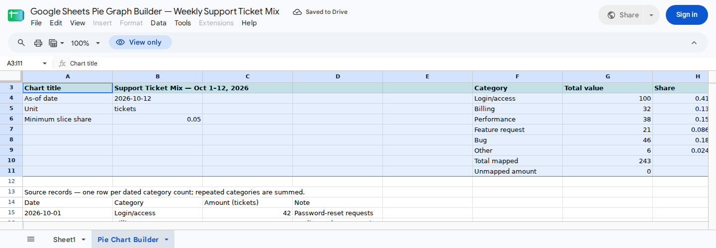
Set the reporting details in B3:B6, then use F3:I11 to verify that the source data is ready for a pie graph.
The baseline example uses the following category and ticket-count inputs in B15:C26. The corresponding dates in column A serve as audit metadata and don’t affect these totals.
| Row | Category | Tickets |
|---|---|---|
| 15 | Login/access | 42 |
| 16 | Billing | 18 |
| 17 | Bug | 27 |
| 18 | Feature request | 12 |
| 19 | Performance | 21 |
| 20 | Login/access | 33 |
| 21 | Other | 6 |
| 22 | Bug | 19 |
| 23 | Billing | 14 |
| 24 | Performance | 17 |
| 25 | Feature request | 9 |
| 26 | Login/access | 25 |
These records aggregate into the chart-ready summary in F3:I9:
| Category | Total value | Share | Review |
|---|---|---|---|
| Login/access | 100 | 41.15% | Chart slice |
| Billing | 32 | 13.17% | Chart slice |
| Performance | 38 | 15.64% | Chart slice |
| Feature request | 21 | 8.64% | Chart slice |
| Bug | 46 | 18.93% | Chart slice |
| Other | 6 | 2.47% | Small slice |
The control total is:
Login/access: 42 + 33 + 25 = 100
Billing: 18 + 14 = 32
Performance: 21 + 17 = 38
Feature request: 12 + 9 = 21
Bug: 27 + 19 = 46
Other: 6

Total: 100 + 32 + 38 + 21 + 46 + 6 = 243 tickets
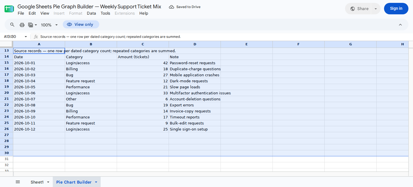
Replace A15:D30 with one dated category count per row. Repeated category labels are combined automatically.
Validate the summary before charting
Before creating the graph, check these cells:
G10equals243, confirming the mapped total.H10equals100%.I10says Ready to chart.G11equals0, confirming there are no unmapped amounts.I11says All mapped.
When a source category isn’t defined in F4:F9, its amount appears in G11. For example, changing B21 from Other to the undefined label Account deletion produces 6 unmapped tickets. It also reduces the mapped total to 237 and changes the controls to Fix unmapped and Fix source labels.
If every source amount is zero, G10 becomes 0 and I10 says Add amounts. A pie graph can’t show meaningful proportions when the total is zero.
Insert the pie graph
Select only F3:G9, which contains the headers and six intended slices.
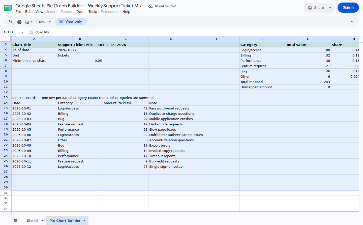
Select F3:G9 to create the pie graph. Exclude rows 10 and 11 because they are validation controls rather than slices.
Next:
- Choose Insert > Chart.
- In Chart editor > Setup, open Chart type.
- Select Pie chart.
- Enable Use row 3 as headers.
- Enable Use column F as labels.
- Confirm that the data range remains
F3:G9.
Google documents the general creation and editing process in its chart and graph help.
Don’t include rows 10 or 11. Total mapped duplicates the sum of the categories, so including it would distort their percentages. Unmapped amount is a validation control rather than a valid slice. A nonzero unmapped amount changes the proportions, while a zero amount can create an unnecessary zero-value category.
Add the title, percentages, and legend
Open the chart’s Customize tab, then apply these settings:
- Under Chart & axis titles, select Chart title and enter
Support Ticket Mix - Oct 1-12, 2026, matchingB3. - Under Pie chart, set Slice label to Percentage.
- Under Legend, choose a position that doesn’t cover the graph.
- Move and resize the finished chart over approximately
A32:I45.
Changing B3 later doesn’t automatically rename the existing chart. You’ll need to update the title manually through Customize > Chart & axis titles.
Review small slices and chart suitability
In the example, Other is flagged because 6 divided by 243 is approximately 2.47%, which is below the 5% threshold in B6.
A small slice isn’t necessarily an error. Keep it separate when the distinction matters. If several related categories are too small to read, you can assign their source records to a clearly defined Other category. Don’t combine categories simply to conceal meaningful differences.
Pie graphs work well for part-to-whole snapshots with relatively few categories. A bar chart is usually clearer when:
- Several values are close together.
- Readers need precise category comparisons.
- There are too many slices to label clearly.
- Values don’t represent parts of one total.
Google’s chart-type documentation describes pie charts as a way to show proportions of a whole.
Update the graph for another period
For a new weekly batch:
- Update
B3:B4with the new title and reporting date. - Clear only
A15:D30. - Enter the replacement records starting in row 15.
- Confirm that the record dates belong to the intended period.
- Recheck
G11,I10, andI11. - Manually update the chart title to match
B3.
For a cumulative view, append records through row 30 instead of clearing the previous batch. The template supports 16 source rows and doesn’t automatically expand, import, synchronize, or filter its source range.
For more detail on refresh behavior, see Do Google Sheets charts update automatically from source data?.
Optionally create or adjust the chart with ModelMonkey
ModelMonkey can inspect spreadsheet context, organize data, and create or adjust charts in Google Sheets. For this example, you could ask:
Inspect Pie Chart Builder!F3:I11. Confirm that the unmapped amount is zero and the status says Ready to chart. Then create a pie chart from F3:G9 with percentage labels and the title from B3. Do not include rows 10 or 11.
Before using the result, review the proposed range, labels, totals, and chart. You can open the ModelMonkey sidebar in Google Sheets for help checking or adjusting the chart.
Wrapping Up
This example uses six categories totaling 243 tickets, calculates their percentages against the correct total, and keeps validation rows outside the graph. Keep the chart range at F3:G9, resolve unmapped categories before charting, and choose a bar chart when close values require more precise comparison.
Frequently Asked Questions
Why is the total appearing as a pie slice?
The selected range probably includes row 10. Change the chart data range to F3:G9 so Total mapped and Unmapped amount remain outside the graph.
How do I show percentages on a Google Sheets pie graph?
Open the chart editor, then choose Customize > Pie chart > Slice label > Percentage. The underlying values can remain ticket counts, expenses, budget amounts, or another consistent unit.
Can I create a pie graph directly from repeated transaction categories?
Summarize the records first. Create one row per category with its aggregated value, then chart that two-column summary. The supplied template combines repeated category labels from B15:B30.
Why is a category missing from the graph?
Check whether its value is zero, its category text differs from the defined summary category, or the row falls outside the chart range. In the template, amounts assigned to undefined category labels appear in G11.
Does the reporting date filter the pie graph?
No. In this template, B4 is display information, while dates in column A are audit metadata. The summary includes every populated source row within A15:D30, so you must clear or replace records when starting a new reporting period.
Should a pie graph include negative values?
No. Pie slices represent nonnegative parts of a positive whole. If your data contains positive and negative variances, use a bar or column chart instead.